
1. ToolBar 설명
안드로이드는 기본적으로 상단에 ActionBar를 제공한다.
ActionBar는 View가 아니기 때문에 Customizing에 어려움을 겪는다. 예를들면 어플의 왼쪽 위 부분에 텍스트 대신 로고를 넣고 싶을때 그렇다.
- ToolBar는 View이다. 그렇기 때문에 Customizing ActionBar에 비해 자유롭다.
- ToolBar는 Api 21 부터 지원되기 시작하였다.
우리는 ActionBar를 사용하지 않을것이기 때문에, 우선 ActionBar를 제거해 줄것입니다.
또한, 이후의 작업에 대한 약간의 응용을 위해 themes.xml(style.xml)의 수정이 필요하겠습니다.
2. themes.xml(style.xml)
...
// 이때 중요한건 parent의 값중에 NoActionBar가 들어가야 한다는것입니다.
<style name="MyApp" parent="Theme.AppCompat.Light.NoActionBar">
	...
</style>
3. Manifest.xml
...
android:theme="@style/MyApp"> // android:theme부분에 themes.xml(style.xml)에서 수정한것을 적용시켜줍니다.
<activity android:name=".MainActivity">
...
ToolBar 구현
- 지금부터 Toolbar를 구현하는 과정에 대해 설명하겠습니다.
TestForToolbar라는 이름을 가진 프로젝트를 하나 생성하겠습니다.

4. main_toolbar.xml
위에서 언급한거처럼 Customizing을 간단하게 진행해 보겠습니다.
(필자는 Logo를 넣을 목적으로 제작했었기 때문에, 간단한 Vector image를 Drawable에 이미 추가한 상태이다.
ImageView를 넣는것은 Customizing을 보여주기 위함이다.)
<?xml version="1.0" encoding="utf-8"?>
<androidx.appcompat.widget.Toolbar
	xmlns:android="http://schemas.android.com/apk/res/android"
    xmlns:app="http://schemas.android.com/apk/res-auto"
    android:layout_width="match_parent"
    android:layout_height="wrap_content"
    android:background="@color/design_default_color_primary_variant">

  <ImageView
      android:layout_width="wrap_content"
      android:layout_height="wrap_content"
      android:src="@drawable/ic_people_wing_hand"
      app:tint="@color/white" />

</androidx.appcompat.widget.Toolbar>
5. main_menu.xml
ActionBar를 보면 오른쪽에 `Three dots`가 존재한다. (`Three dots`버튼은 밑에서 구현할 것이다.)
이를 클릭했을때 선택할 수 있는 menu가 존재하는데 우리는 이를
만들어서 넣어줄 것이다.
<?xml version="1.0" encoding="utf-8"?>
<menu xmlns:android="http://schemas.android.com/apk/res/android">
	<item
    	android:id="@+id/it_menu_item_1"
        android:title="분류1"/>
    <item
    	android:id="@+id/it_menu_item_2"
        android:title="분류2"/>
</menu>
6. activity_main.xml
이제 ToolBar를 activity_main.xml layout에 적용시켜 보겠다.
미리 생성해두었던 `main_toolbar.xml`를 inclue 태그를 통해 포함시켰다.
이때 중요한건 include로 포함한 `ToolBar` layout의 id이다.
main_toolbar.xml에서 ToolBar에 대해 id를 세팅할 수 있었지만 그렇지 않은 이유는,
조금 뒤인 MainActivity 설명에서 이어 진행하겠다.
(아래 TextView는 test를 위해 사용한 것이다. 해당 예제에서는 필요없다.)
<?xml version="1.0" encoding="utf-8"?>
<androidx.constraintlayout.widget.ConstraintLayout xmlns:android="http://schemas.android.com/apk/res/android"
    xmlns:app="http://schemas.android.com/apk/res-auto"
    xmlns:tools="http://schemas.android.com/tools"
    android:layout_width="match_parent"
    android:layout_height="match_parent"
    tools:context=".MainActivity">

    <include
        android:id="@+id/tb_main"
        layout="@layout/main_toolbar"/>

    <androidx.constraintlayout.widget.ConstraintLayout
        android:layout_width="0dp"
        android:layout_height="0dp"
        app:layout_constraintTop_toBottomOf="@+id/tb_main"
        app:layout_constraintLeft_toLeftOf="parent"
        app:layout_constraintBottom_toBottomOf="parent"
        app:layout_constraintRight_toRightOf="parent">

        <TextView
            android:text="For Test"
            android:layout_width="wrap_content"
            android:layout_height="wrap_content"
            android:gravity="center"
            app:layout_constraintTop_toTopOf="parent"
            app:layout_constraintLeft_toLeftOf="parent"
            app:layout_constraintBottom_toBottomOf="parent"
            app:layout_constraintRight_toRightOf="parent"/>


    </androidx.constraintlayout.widget.ConstraintLayout>

</androidx.constraintlayout.widget.ConstraintLayout>
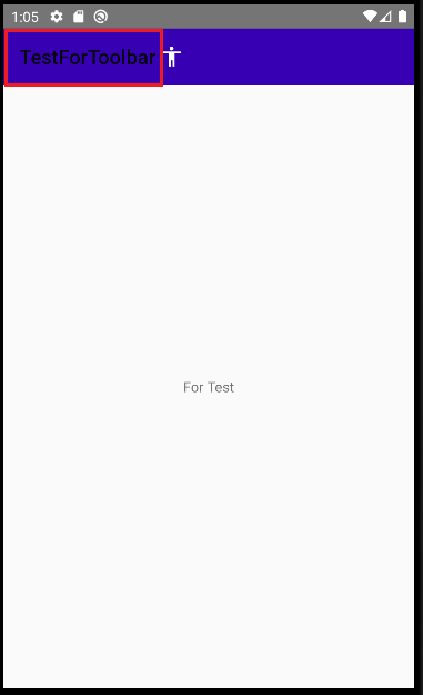
7. 중간점검
현재까지 진행하게 되면 밑의 캡처된 사진과 같은 모양을 가지게 된다.
8. MainActivity.class
중간점검에서 보다싶이, 우리가 원하지않는 글자가 들어가있는것을 확인할 수 있다.
이에 대한 제거와 동시에 Toolbar를 어떻게 사용하는지에 대해서 알아보자.
package com.example.testfortoolbar;
import androidx.annotation.NonNull;
import androidx.appcompat.app.AppCompatActivity;
import androidx.appcompat.widget.Toolbar;
import android.os.Bundle;
import android.view.Menu;
import android.view.MenuInflater;
import android.view.MenuItem;
import android.widget.Toast;
public class MainActivity extends AppCompatActivity
{
Toolbar tb;
@Override
protected void onCreate(Bundle savedInstanceState)
{
super.onCreate(savedInstanceState);
setContentView(R.layout.activity_main);
tb = findViewById(R.id.tb_main);
setSupportActionBar(tb);
getSupportActionBar().setTitle("");
}
@Override
public boolean onCreateOptionsMenu(Menu menu)
{
MenuInflater menuInflater = getMenuInflater();
menuInflater.inflate(R.menu.main_menu, menu);
return true;
}
public void toastMessage(String msg){
Toast.makeText(this, msg, Toast.LENGTH_SHORT).show();
}
@Override
public boolean onOptionsItemSelected(@NonNull MenuItem item)
{
switch(item.getItemId()){
case R.id.it_menu_item_1:
toastMessage("it_menu_item_1");
break;
case R.id.it_menu_item_2:
toastMessage("it_menu_item_2");
break;
default:
break;
}
return super.onOptionsItemSelected(item);
}
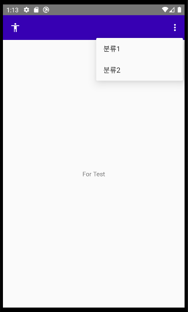
}9. 결과

약간의 응용단계
- `Three dots` 이미지의 색깔 변화
- 메뉴의 위치 변화
10. `Three dots` 이미지의 색깔 변화
안드로이드 style 태그 내의 item의 속성중에 `android:actionOverflowButtonStyle`이 존재합니다.
해당 속성은 `Three dots`의 색상을 변화시킬 수 있습니다.
<style name="MyApp" parent="Theme.AppCompat.Light.NoActionBar">
...

	<item name="android:actionOverflowButtonStyle">@style/OverFlowButton</item>-->
</style>

<style name="OverFlowButton" parent="Widget.AppCompat.ActionButton.Overflow">
	<item name="tint">@color/white</item>
</style>
1. OverFlowButton 이라는 이름을 가진 style태그를 생성
2. parent는 `Widget.AppCompat.ActionButton.Overflow`를 가진다.
3. 해당 이미지의 tint 속성을 통해 원하는 색상으로 덮어씌워 준다.
11. 메뉴의 위치 변화
개인적으로 메뉴의 위치가 ToolBar의 위가 아닌, 아래에 위치 했으면 좋겠다고 생각했습니다.
`overlapAnchor` 과 `android:dropDownVerticalOffset` 속성을 통해 변경하여 줄 것입니다.
    <style name="MyApp" parent="Theme.AppCompat.Light.NoActionBar">
		...
        <item name="overlapAnchor">false</item>
        <item name="android:dropDownVerticalOffset">?attr/actionBarSize</item>
    </style>
1. `overlapAnchor` 속성을 false로 설정하여, 이동에 제한을 푼다.
2. `android:dropDownVerticalOffset` 속성을 사용하여 `?attr/actionBarSize`(안드로이드가 가지고 있는 속성값중 ActionBar의 기본값) 만큼 세로로 이동시켜 준다.
12. 최종결과
틀린부분이 있다면 바로 수정할 수 있도록 하겠습니다.
읽어주셔서 감사합니다.
'Android' 카테고리의 다른 글
| Android :: RoomDatabase inital data(PrePopulating) 데이터베이스 초기 데이터 값 저장하기 (0) | 2021.05.20 |
|---|---|
| Android :: Notification을 사용하여 간단한 알림을 만들기(예제포함) (0) | 2021.05.17 |